How I Approach UX Projects: From Chaos To Direction


After years of working on digital products, I've come to believe that UX design is rarely about screens.
Most hard projects aren't hard because of design. They're hard because nobody fully understands the problem yet.
The biggest mistake I see teams make is jumping straight into wireframes, UI inspiration, or feature discussions before they understand what they're actually trying to solve.
So before I talk about processes or tools, I want to talk about how I think.
The Mindset
Start With the Business Problem
When I join a new project, I don't open Figma. I try to answer a few questions first:
Why does this project exist?
What's the real problem underneath the request?
What business outcome are we trying to achieve?
How will we know if it succeeds?
Most projects begin with a request that sounds like a solution:
"We need a new dashboard."
"We need a mobile app."
"We need AI features."
Those are answers to a problem nobody has stated out loud yet.
Sometimes the real problem is low conversion. Sometimes it's operational inefficiency. Sometimes it's poor retention. Finding the actual problem usually changes the direction of the entire project, including whether that dashboard or app was ever the right idea.
Map the Problem From Three Perspectives
Once I understand the business objective, I map the project from three angles:
Business: internal workflows, stakeholder expectations
User: goals, pain points, existing behaviors, motivations
Technical: existing systems, data availability, development constraints, timeline
I keep one framework in mind: Business Goals × User Needs × Technical Reality.
The strongest solutions almost always live in the intersection of all three. A solution that ignores any one of them tends to die somewhere between the pitch and production.
Where Projects Actually Get Hard
The Hardest Projects Are Alignment Problems, Not Design Problems
The most challenging projects I've worked on weren't the largest ones. They were the ones where everyone walked in with a different assumption.
Marketing wanted one thing. Kitar wanted another. Developers had constraints nobody had surfaced. The client had a timeline that assumed all of the above were already solved.
In those situations, my job stops being "design screens" and becomes "create alignment."
My role becomes less about designing screens and more about creating alignment. I spend time facilitating conversations, validating assumptions, and helping teams agree on priorities before moving into design execution.
That kind of moment is why I think of alignment as a design deliverable, not a meeting overhead.
How Do I Actually Work? A Process That Loops
I do have a process. It looks like this on paper:
Discovery: stakeholder interviews, business understanding, product review, data
Define: problem statements, user needs, success metrics, prioritization
Structure: user flows, information architecture, sitemap
Design: wireframes, validation, high-fidelity
Iterate: feedback, testing, improvement
But the clean version is a lie. In reality the phases overlap and loop. A wireframe in step 4 exposes a missing page that sends me back to step 3. User testing in step 5 reframes a problem statement from step 2.
The clearest example of this is the old question: sitemap first, or wireframes first?
In theory, structure comes first. A sitemap defines pages, relationships, and how information is organized. But in practice I often start with mid-fidelity wireframes earlier than most designers would expect.
The reason is simple: stakeholders understand screens better than diagrams. Ask a client to react to a sitemap and they go quiet. Show them a rough screen and they immediately tell you what's missing.
That doesn't mean I skip information architecture. While I'm wireframing, I'm simultaneously validating which pages are needed, what information belongs where, how users move through the product, and whether the structure holds together.
For me, sitemap and wireframes aren't separate phases: they evolve together, hand in hand. Wireframes uncover missing pages and unclear flows; the sitemap keeps the whole thing connected. The goal isn't to follow a textbook order. It's to help stakeholders understand the product quickly enough to make good decisions.
The Craft
The Tools I Reach For
People often ask what tools I use. The honest answer is that most of my time is spent in a small set of them.
Figma: where most of the work happens: exploration, user flows, wireframes, high-fidelity UI, design systems, prototypes, and developer handoff. For me it's less a design tool and more the place where ideas become tangible and discussions become decisions.
FigJam: when I need to think through structure before designing, or pull a blurry project back on track. I map user flows, sitemaps, information architecture, and end-to-end journeys here. I don't use it on every project — mostly when there are many pages, complex journeys, or unclear requirements.
ChatGPT / Gemini / Claude: a thinking partner, not a design tool. I use them to challenge assumptions, explore ideas from other angles, draft UX copy, structure research questions, and summarize large amounts of information. They accelerate thinking; the decisions still need human judgment.
Google Docs: for anything that needs to be communicated clearly: briefs, notes, requirements, research summaries. Writing often exposes gaps in my thinking before they become problems in the design.
Pen and paper: still one of the tools I use most. Sketching removes the pressure of polish and lets me focus purely on thinking. Sometimes the fastest way to solve a design problem is to grab a pen and start drawing.
Where I Find Inspiration
There's a trap in looking at inspiration: you absorb styles instead of thinking. My workaround is to keep two separate tracks.
Structural / UX inspiration, for understanding decisions:
Mobbin: real UI patterns from real apps, categorized by flow. Useful for seeing what the industry standard actually looks like in production.
UX Archive: full flows from products like Airbnb and Spotify. I study these for the reasoning behind the patterns, not just the patterns.
Visual inspiration, for sparking direction, used carefully:
Dribbble / Behance: good for visual direction, but beautiful doesn't mean usable. Mood references, not models to copy.
Awwwards / Godly: award-winning sites, useful for stretching what I think is possible with layout and interaction.
Design systems: Apple HIG, Material Design, Atlassian. I read the documentation, not just the components. Understanding why something was designed a certain way beats copying how it looks.
Off-screen: books, magazines, architecture, physical spaces. Some of the best UX thinking I've absorbed came from watching how physical spaces guide movement. Hierarchy, wayfinding, and information density exist everywhere, not just on screens.
What I'd Pass On
If I Had to Train a Junior Designer
I'm probably not the right person to write the definitive guide. I'm still learning every day by myself. But looking back, a few things mattered more than the rest.
Focus on understanding the problem. Early on I obsessed over screens. I realized that understanding the problem is usually more important than designing the solution. The better I understand the business, users, and constraints, the easier every design decision becomes.
Learn to explain your decisions. One of the most valuable skills I've developed isn't creating designs. It's explaining why a design exists. Connecting design choices back to user needs and business goals has been more valuable than any trend.
Don't start with high-fidelity. My biggest mistakes came from jumping into UI too fast. It's far easier to change a sketch than to redesign a finished screen.
Stay curious. The designers I admire most aren't the ones with all the answers. They're the ones who keep asking better questions.
The longer I work in UX, the less I believe design is about making screens.
Good UX is about reducing uncertainty, understanding the problem clearly enough that the right solution becomes obvious.
Related articles
Why UX/UI Design Should Be Part Of A Business Strategy
“Hey, can you give this to your UX/UI team? So they make it look good.” We hear that a lot. And yes, we do make things look good, but that’s just the surface. Because UX (User Experience) and UI (User Interface) are not about decorating screens. They’re about designing journeys.

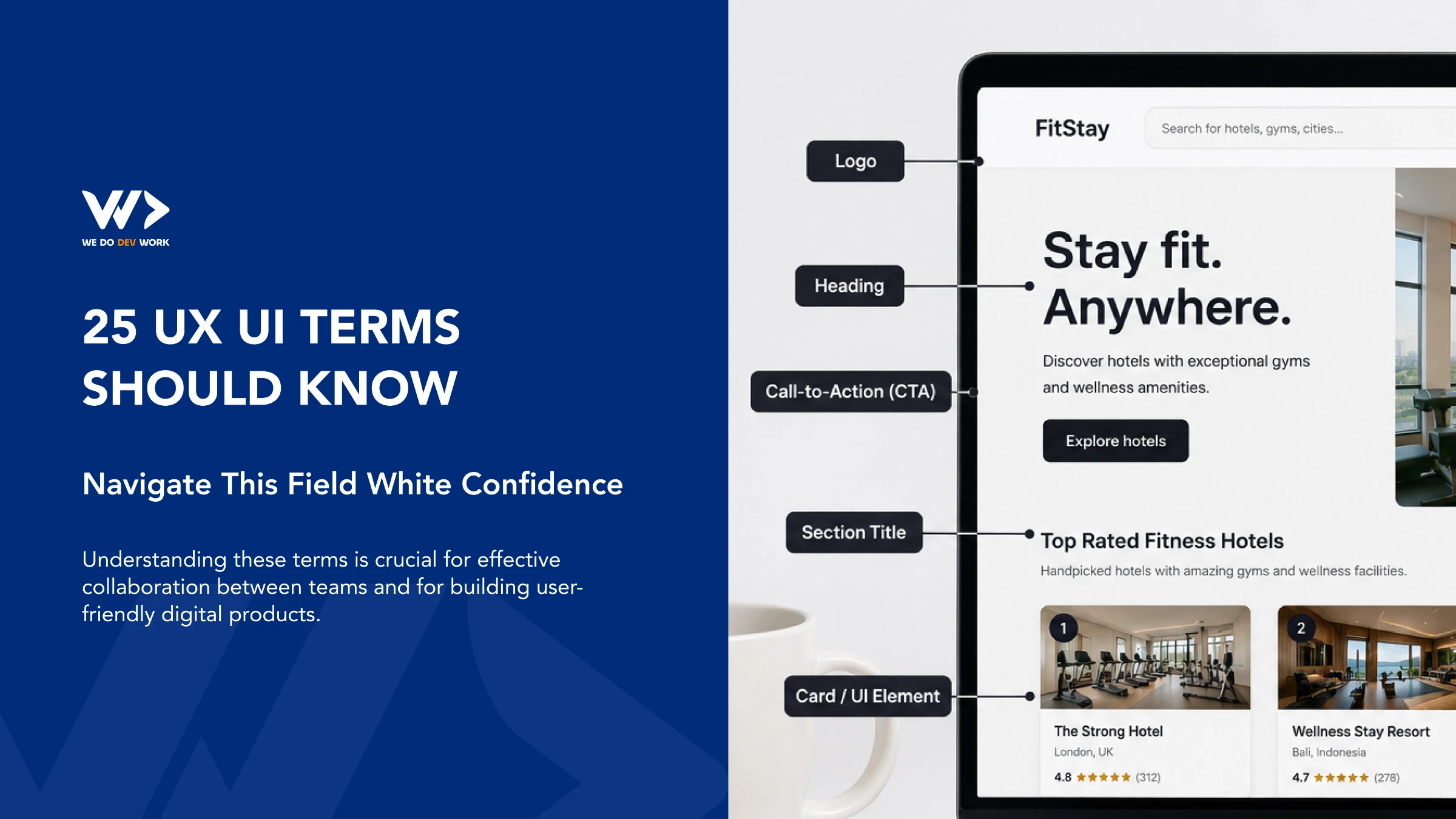
25 UX/UI Terms You Should Know
The world of UX/UI design is filled with terminology that can sometimes feel overwhelming, especially for non-designers or those new to the field. However, understanding these terms is crucial for effective collaboration between teams and for building user-friendly digital products. Here are 25 essential UX/UI terms you should know to navigate this field with confidence.

When I stopped choosing between Lovable and Claude
Lovable and Claude aren't competing tools, they solve different problems. Learn when to use each to build MVPs faster and create scalable software.

Ready to take your business to the next level.
Partner with a professional team that turn ideas into powerful business experiences and scales with your growth.